

Helping an old symbol speak for the new.
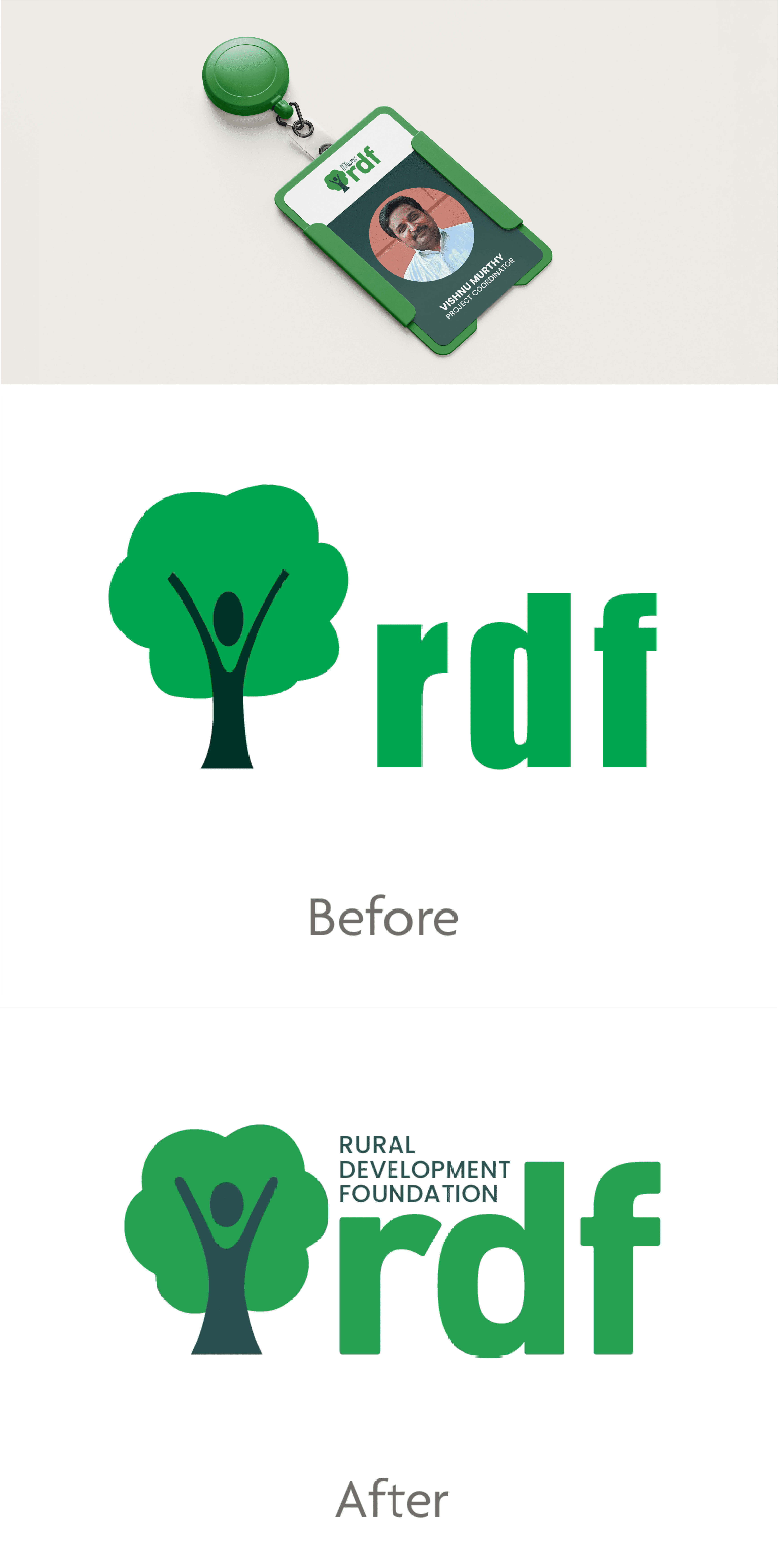
For over 25 years, RDF’s tree had represented the growth and education of children across rural Telangana. As the organisation expanded its work and reach, its identity needed to grow with it. The task was not to replace something so closely tied to its history, but to give it renewed clarity while preserving the meaning and recognition it had accumulated over time.

The Approach
We began with what already mattered and what was most recognised. The tree remained at the centre, but was refined into a stronger, clearer expression of the organisation it had come to represent. From there, we looked beyond identity to how RDF spoke about itself. The same honesty, openness and lack of pretence we encountered in its people needed to shape the experience of the brand.



The Solve
The refreshed identity retains the tree and everything it has come to stand for, while giving it a more assured presence for the future. The website extends this spirit through honest photography, warm textures and straightforward communication, bringing the people and work of RDF closer to its audience. We picked up language from the organisations everyday routine to bring out it’s personality. Together, the system now feels less like an organisation presenting itself and more like an invitation to understand the lives and communities behind its work.


Project Credits:
Vydika Rao, Varsha Kancherla