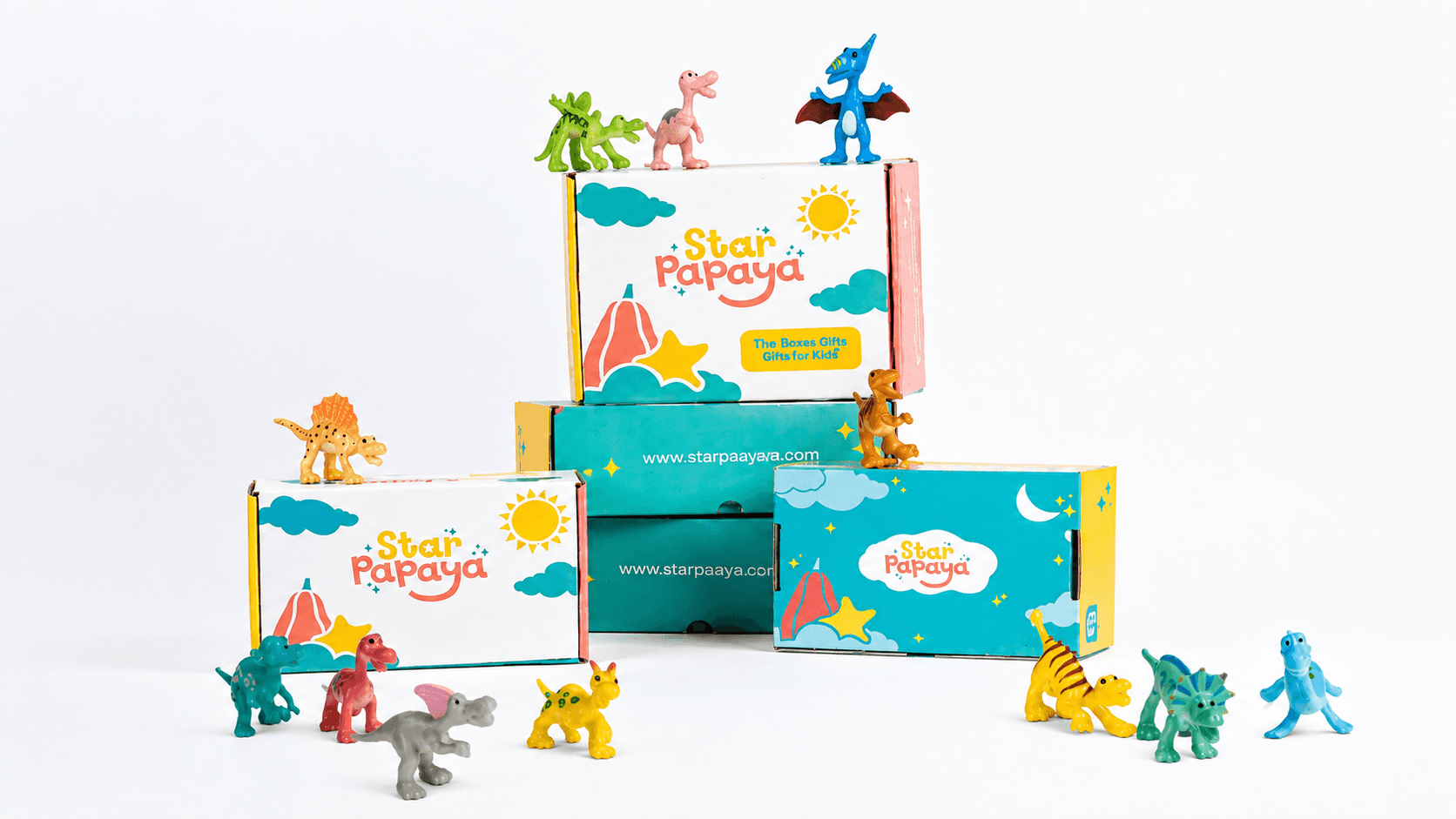
Star Papaya
Visual Identity, Packaging
Industry:
Mining
Year:
2024
A small ask, with a whole world behind it.
Star Papaya began with two mothers and the stories they built for their children.
Tara and Maya became the quiet inspiration behind the name: Star and Papaya. What began as something personal grew into a larger belief that childhood deserves a world shaped by creativity, curiosity and make-believe.
The founders wanted other children to experience the kind of wonder their own children found in stories: enchanted woods, extraordinary afternoons and worlds where the everyday could turn into something else entirely.
When they came to us, the ask was simple: a logo and packaging.
But behind that small brief was a much larger question.
How do you make something simple still feel like wonder?
The Challenge
A children’s brand can easily become loud, overly cute or dependent on familiar visual codes of childhood.
Star Papaya needed something gentler as well as elaborate. A simple logo wasn't going to represent an entire world.
The identity had to feel imaginative without becoming decorative, playful without becoming noisy, and simple enough to live across products and packaging while still leaving room for a child’s imagination to enter.
The opportunity was not to illustrate an entire fantasy world for them.
It was to create just enough of one that reminds them of their imaginative world.