Earth House

Earth House

Visual Identity
Visual Identity
Industry: Education
Industry: Education
Year: 2025
Year: 2025

Finding play within.


Finding play within.

Earth House began with a name that already held a world within it.


A Montessori environment shaped around a child’s natural instinct to explore, it saw learning as something that could be discovered through space, material, nature and play. Our task was to create an identity that could carry this philosophy without falling into the familiar visual language of Montessori education.


Interestingly, Earth House came to us at the same time as another Montessori school. We were transparent with both founders from the beginning, but quickly realised that the schools themselves were remarkably distinct. Both were shaped by strong individuals with very different ideas of what a Montessori environment could feel like.


The challenge, then, was not differentiating one school from another. It was finding a distinct expression within Montessori itself.


The Approach

Let the name build the world.

We began with Earth House.


The name gave us something wonderfully tangible to work with: earth, shelter, landscape and the idea of a place where learning could be led as much by the environment as by the adult.


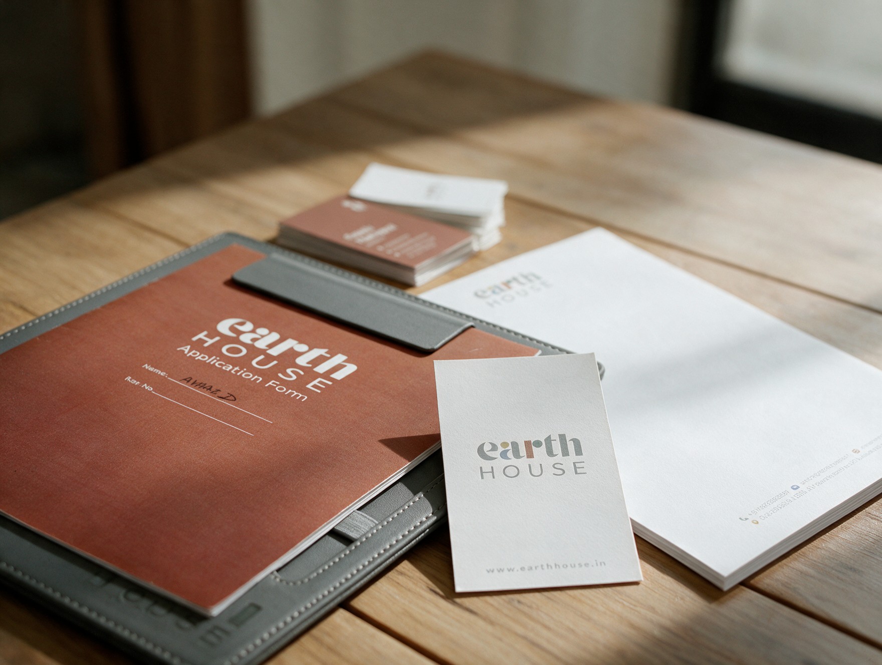
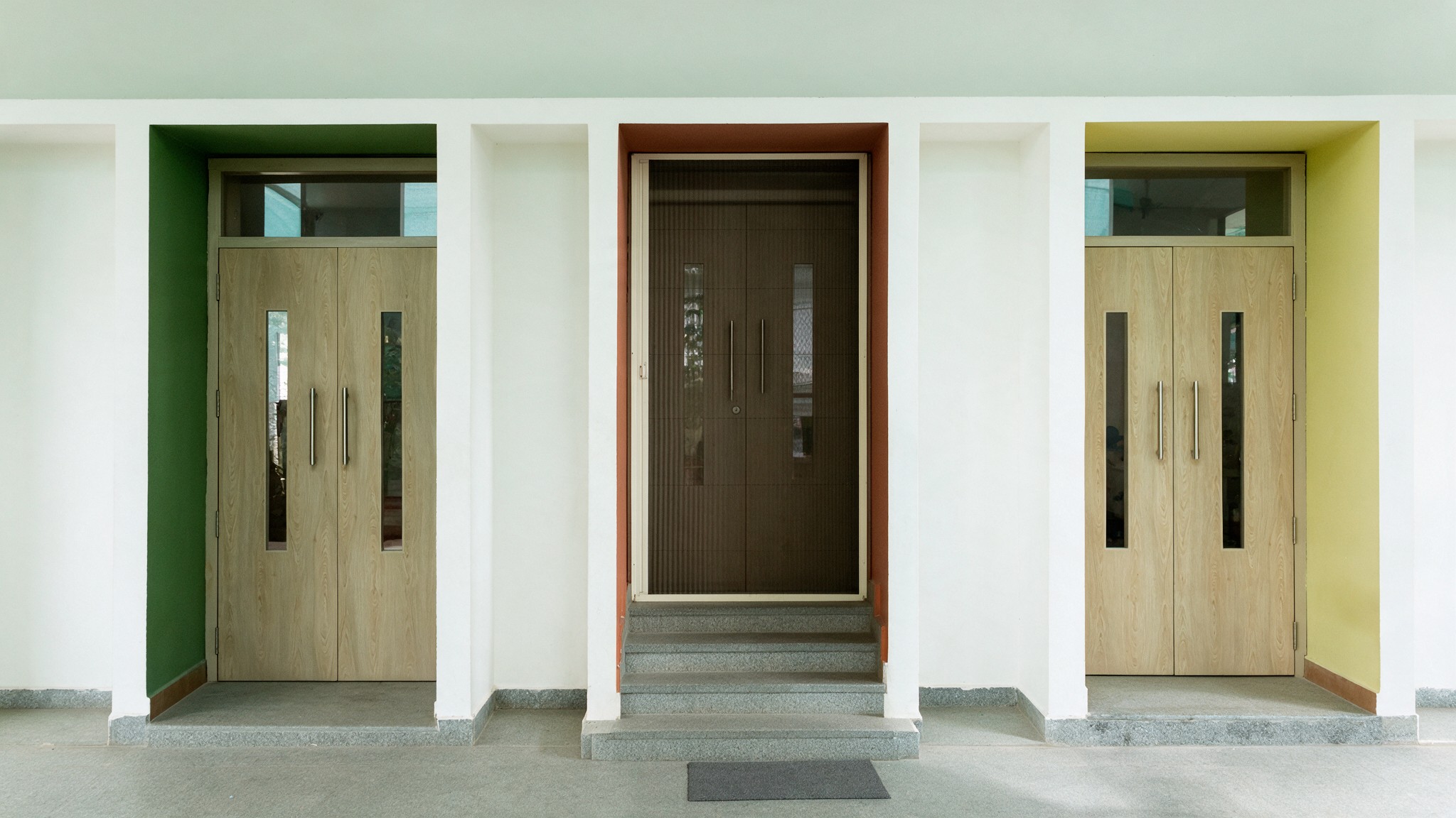
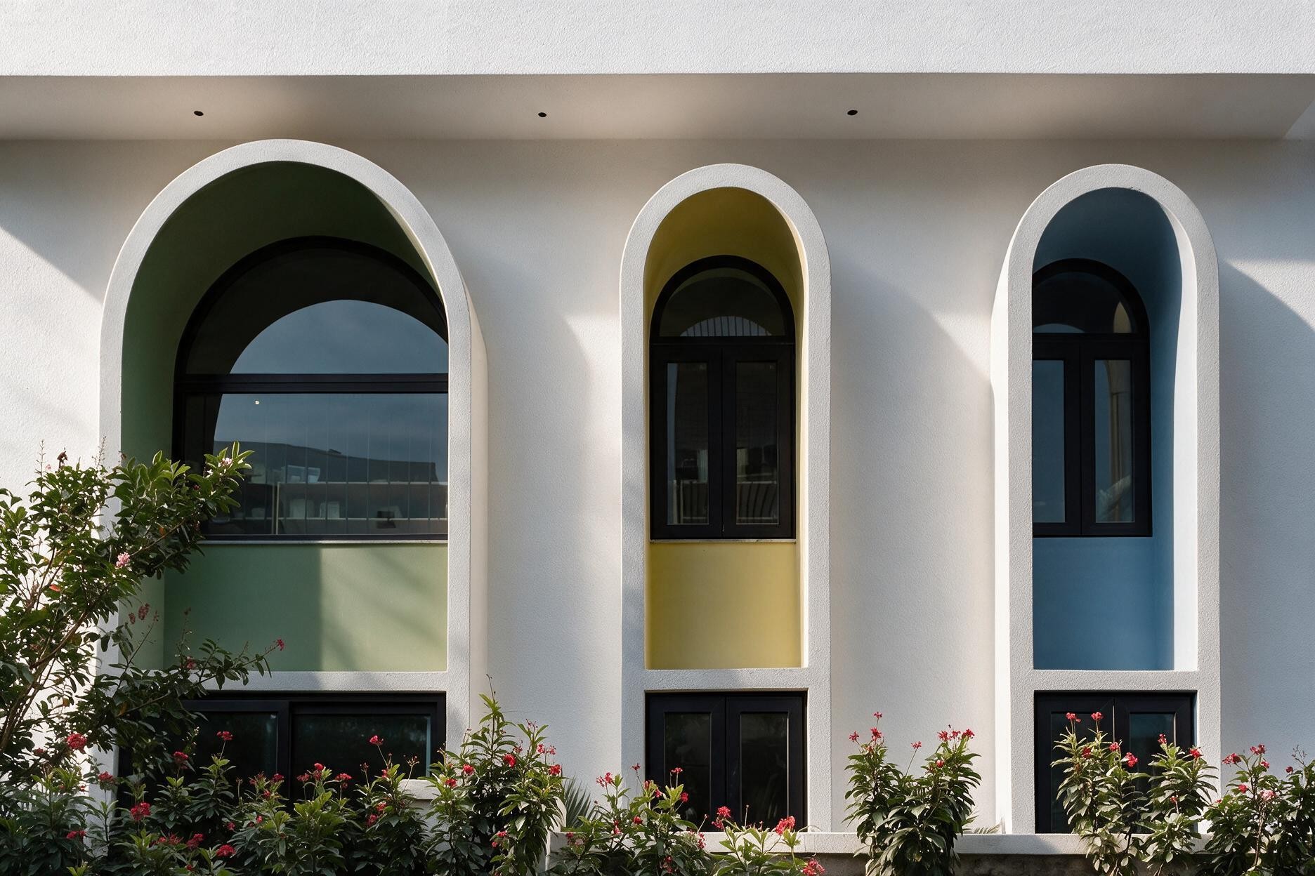
Rather than illustrating these ideas literally, we explored the colours, forms and textures one might encounter in this world. Earthy tones became an important part of the identity, bringing warmth and nature into the system without making it feel overly rustic or expected.

The logo followed the same principle.

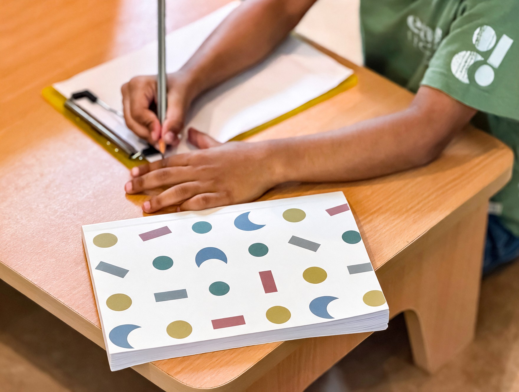
Built from shapes inspired by the spaces and forms children encounter at Earth House, it refuses to resolve into a single meaning. Look closely and you might find land, a sun or moon, a house, or children at play. Someone else might see something entirely different.


That openness became the point.

Much like Montessori itself, the identity creates a structure without prescribing what must happen within it. There is enough form to hold the world together, and enough freedom for imagination to take over.


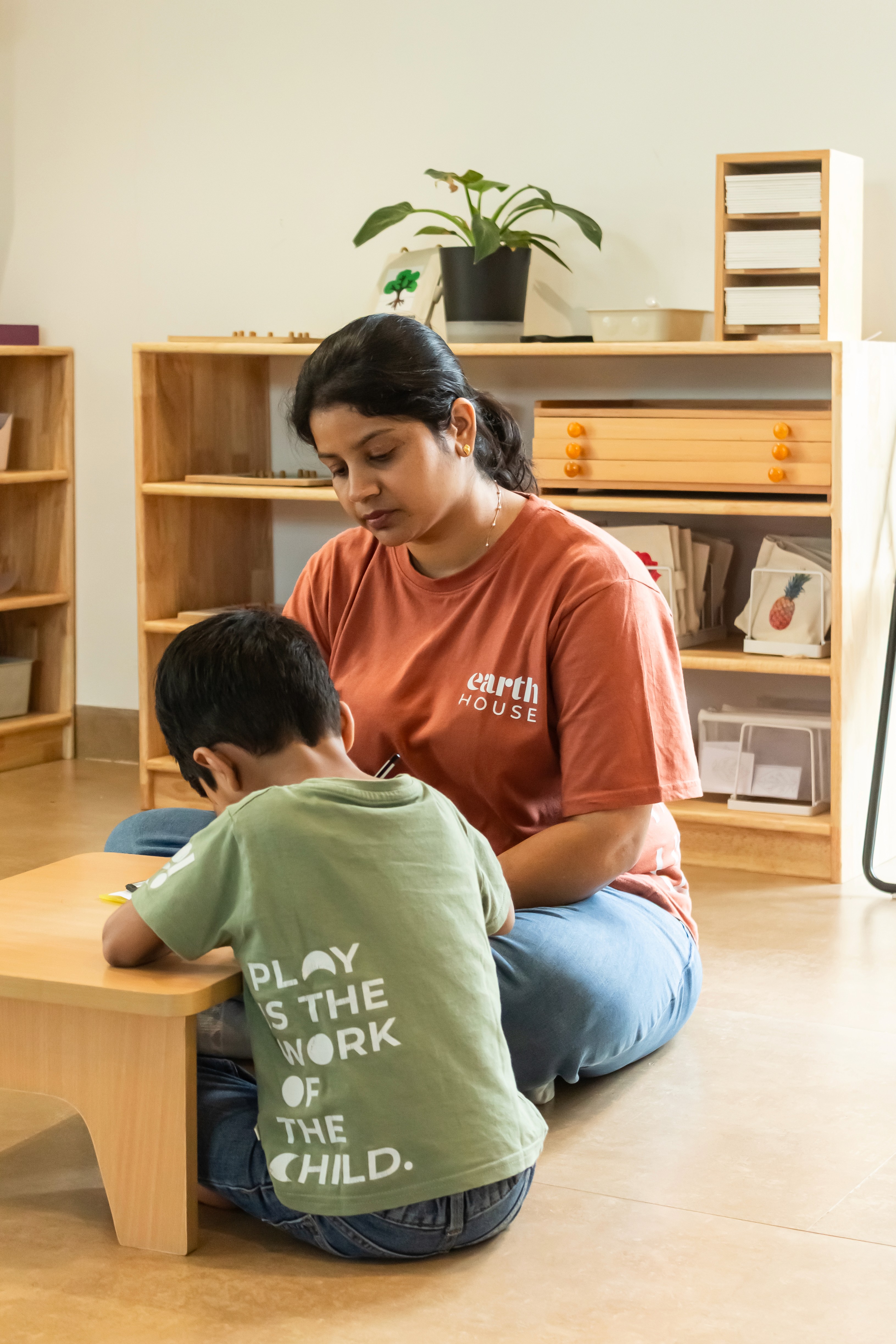
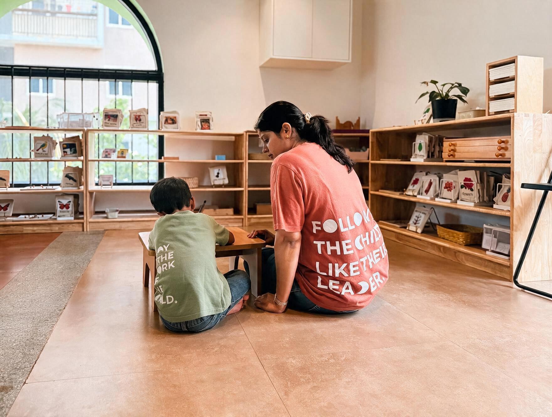
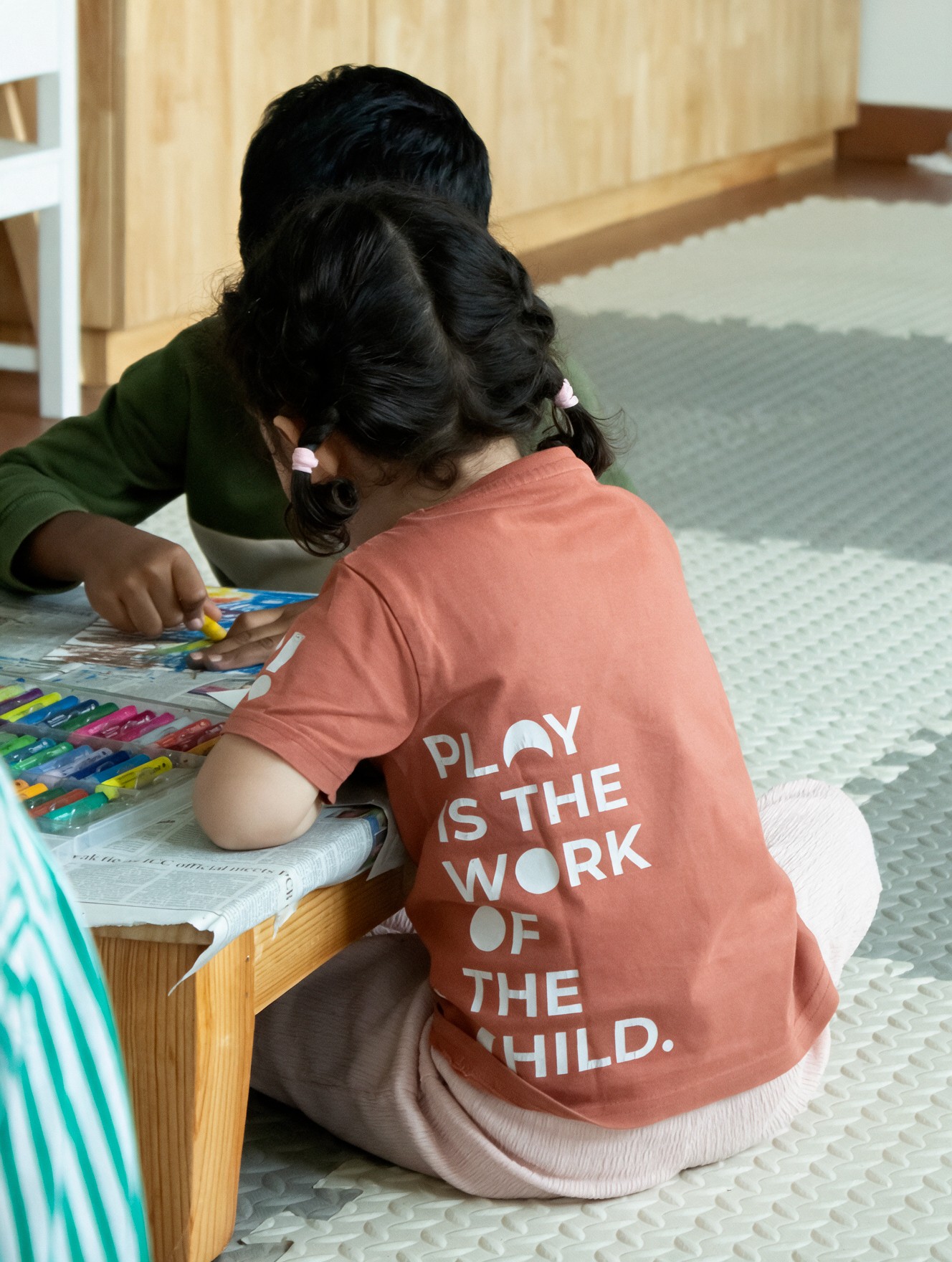
We then took these forms outside the logo and allowed them to find their way into the school’s typography. Select letters within the typeface were replaced by shapes from the identity, giving everyday words a little bit of Earth House within them.

What began as a typographic detail soon became a space for play. Words could shift, change and be rediscovered across uniforms and school merchandise, giving the visual language room to behave differently wherever it appeared.


A system with rules, but also room to play — much like the world it was designed for.

Oon Studio is a branding and design studio in Hyderabad, India, helping businesses engineer brands with depth, meaning and distinction. We dive deep into a brand’s origin, audience, culture, context and ambition to uncover what makes it significant and find where it can belong. Our process spans strategy workshops, brand strategy, verbal identity, visual identity, visual language, brand design, communication design, packaging design, website design, launch campaigns and ongoing brand communication. From building new brands to reviving and evolving established ones, we bring together strategic thinking, storytelling and considered design to create identities that are distinctive, relevant and built to evolve.

Logo

Banjara Hills, Hyderabad, India

+91 99632 66630

© Oon Studio 2026

Oon Studio is a branding and design studio in Hyderabad, India, helping businesses engineer brands with depth, meaning and distinction. We dive deep into a brand’s origin, audience, culture, context and ambition to uncover what makes it significant and find where it can belong. Our process spans strategy workshops, brand strategy, verbal identity, visual identity, visual language, brand design, communication design, packaging design, website design, launch campaigns and ongoing brand communication. From building new brands to reviving and evolving established ones, we bring together strategic thinking, storytelling and considered design to create identities that are distinctive, relevant and built to evolve.

Logo

Banjara Hills, Hyderabad, India

+91 99632 66630

© Oon Studio 2026

Oon Studio is a branding and design studio in Hyderabad, India, helping businesses engineer brands with depth, meaning and distinction. We dive deep into a brand’s origin, audience, culture, context and ambition to uncover what makes it significant and find where it can belong. Our process spans strategy workshops, brand strategy, verbal identity, visual identity, visual language, brand design, communication design, packaging design, website design, launch campaigns and ongoing brand communication. From building new brands to reviving and evolving established ones, we bring together strategic thinking, storytelling and considered design to create identities that are distinctive, relevant and built to evolve.

Logo

Banjara Hills, Hyderabad, India

© Oon Studio 2026